Article
Covenant has started in 2018 as a school exercise at EsadType post-graduate course in Amiens. At the time, I drew a small family in 4 styles: Roman & Italic both in two optical sizes: Book & Display. First as a side experiment, the ‘simplification through mechanization’ became the core design feature — my guideline to shape the outlines. My first intention in Covenant was to work on a vertical axis Modern typeface and specifically from Scotch Roman sources. The Scotch Romans are a subcategory in the wide range of Modern typefaces. This terms has been created to qualify the modern faces produced in the Scottish type foundries Alexander Wilson & Sons (Glasgow) and William Miller & Co (Edimburg) in the beginning of the 19th century. Then those Scottish typefaces have been used as models for many American typefaces known as ‘Modern’ as well. Theodore Low De Vinne11 De Vinne, Plain printing types, 1900 describes the Scotch Roman style as ‘a small, neat, round letter, with long ascenders, and not noticeably condensed or compressed.’ The particularity of Scotch Romans is their hybrid state between a transitionnals text typeface and a fully Modern one. The high vertical contrast is modulated by the reminiscence of ‘textual’ bracketted serifs. This “in between” look was the starting point. I wanted to experiment all the features needed to push the design on the direction of a text typeface with the dryness and geometry present in more conventional modern fonts.
Sources
The mandatory reference about Scotch Romans, was the one from Miller & Richard, the Miller Pica n°2 cutted by Richard Austin that has been used as model for the American later scotches.
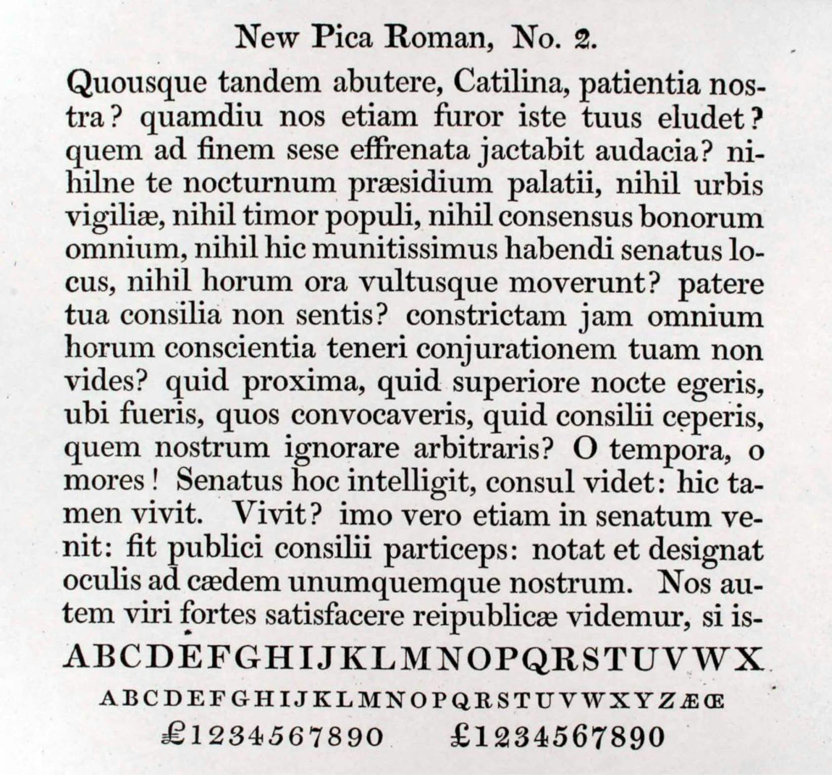
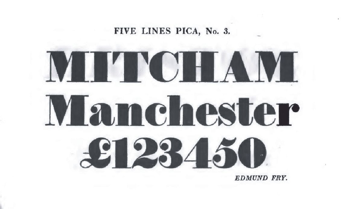
I quickly focused on the main structure and its mechanical rigidity. The idea was to create a link between the Scotch Roman general texture still moderated and subtile with some of the caricatural exagerations and simplifications seen in fat faces. The Modern faces always striked me as an emphasis on the construction of letters, loosing all the features coming from the writing logic. So I wanted the user to catch clearly those mechanical principles in the construction of PoW Covenant letters. It is also important to clarify that since the beginning this project has nothing to do with a revival. I just defined creative principles from a specific group of sources and then follow them while drawing and extending the lettershapes. The fidelity to the sources has never been an objective, even if the link to Scotch Romans is claimed and still visible in some way. Refering to Ricardo Olocco and Michel Patanè’ names given to design approaches: Synthetic or Litteral22 Olocco & Patanè, Designing Type Revivals, Lazy Dog Press, 2022, p. 18-22, the cursor would be on the synthetic side but outside of the Revival scope because of the emphasised caricatural final aspect.

Design
Vertical Axis and Geometry
The vertical axis and proportions are kept from the sources of Miller Pica n°2. The vertical metrics of Scotch Roman are quite suitable for contemporary standards, ascenders are already aligned to cap height. Only the x-height has been slighly modulated to have bigger x-height. It participates to give a compact feeling (along with the new definition of contrast → fig 04) and shortens the long ascenders.
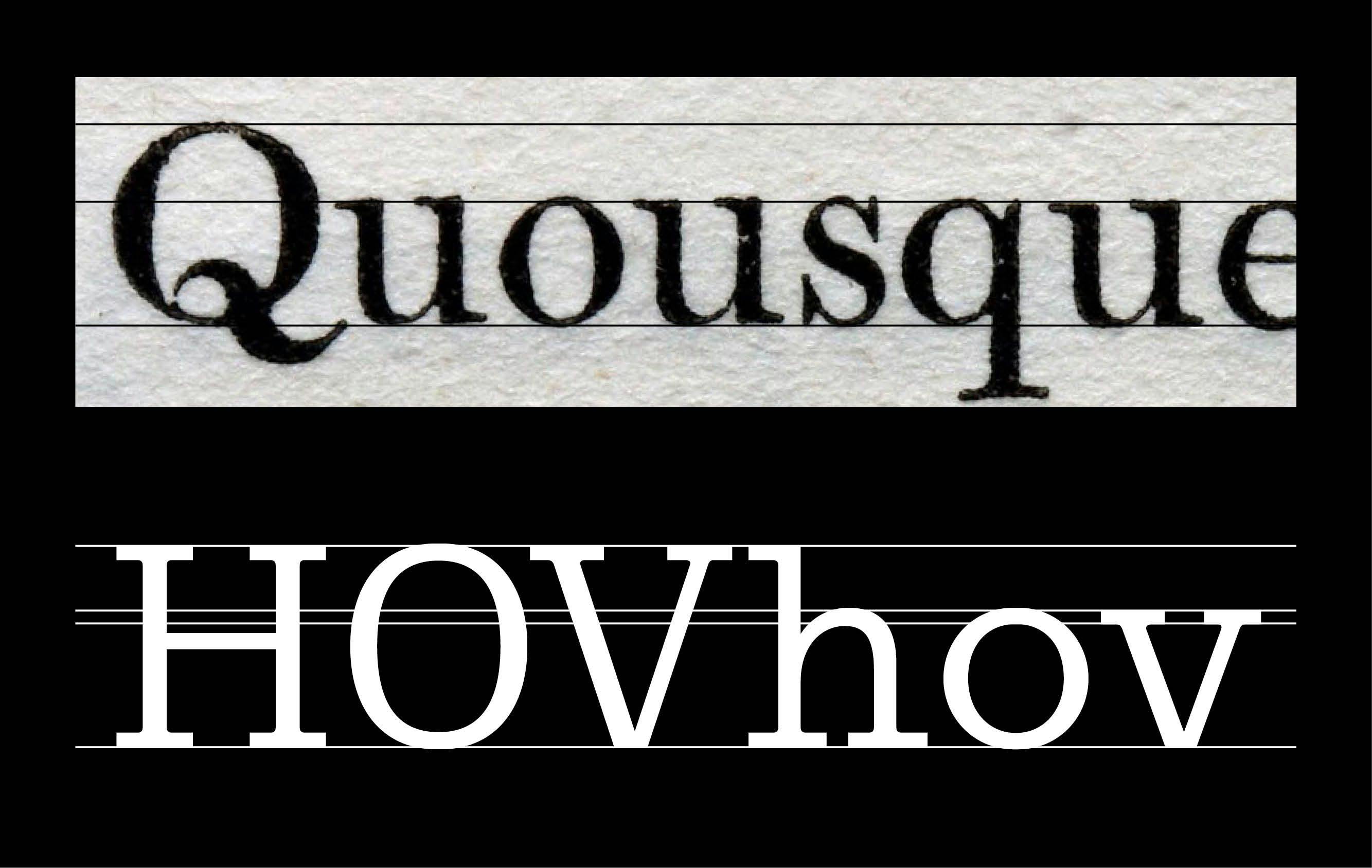
The main approach of Covenant design is a geometrical drawing of Modern proportions. On the uppercases, I derivated from the sources with a rework of proportions to make them more proportional all together. Those wide capitals are typical according to Mosley who describes Scotch Roman as ‘a broad, vigorous type whose heavy capitals […]’. I compensated them in more condensed mechanical oval shape. The flat serifs are still smoothly connected to the stems. All this kind of typical scotch roman details, with endings on /a /t and the more complex shapes are kept to emphasize the texture.
Low Contrast
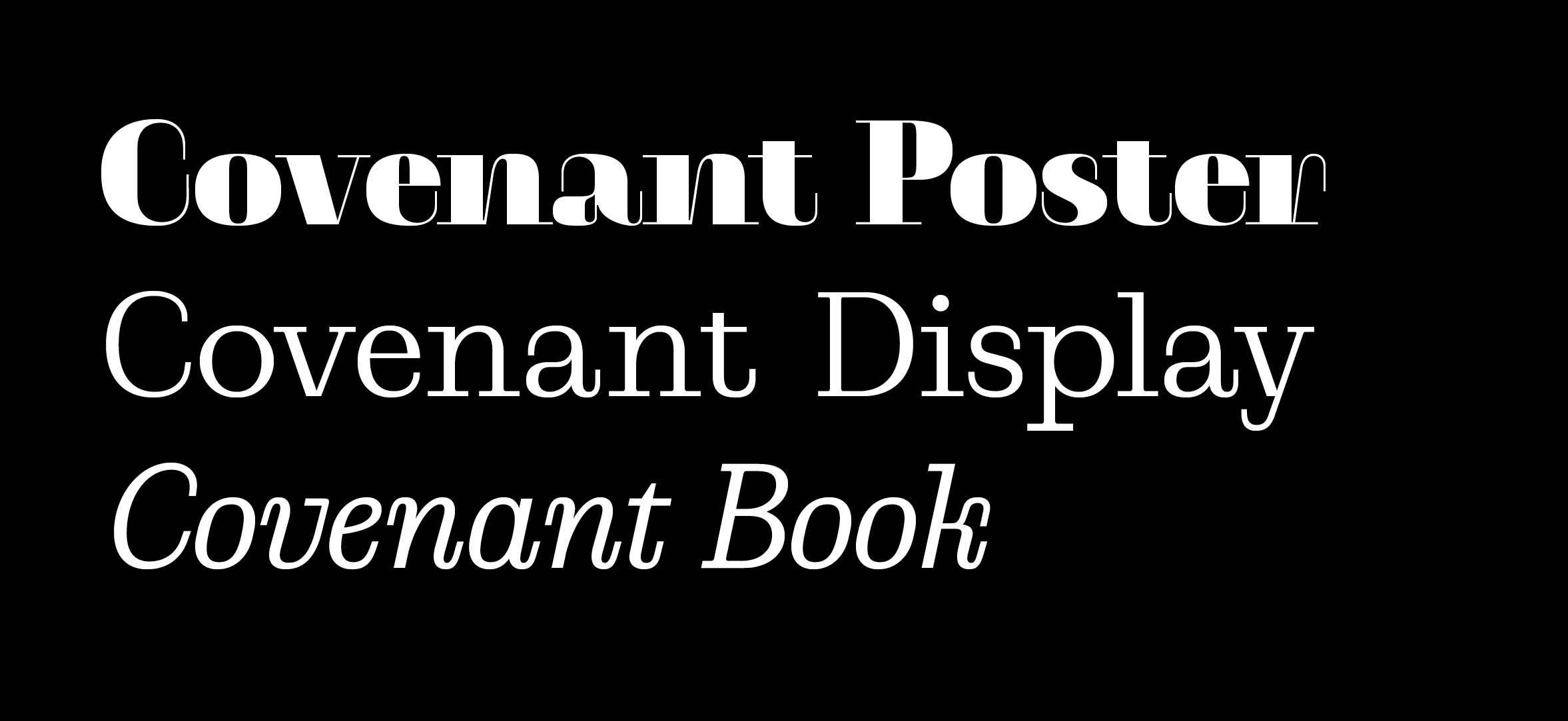
The first attempt of Covenant was made of two optical sizes that played on the Thick/Thin contrast and their following italics. I felt the “book version” with a lower contrast was more interesting in this direction of a text typeface. It is a good way to reverse the concept coming from high contrast sources. It gives more attention to the ‘hidden’ structure of the Scotch Romans, and emphasized the thin parts that usually tend to optically disappear. This new contrast and unusual weight on thin parts gives an interesting horizontal balance to PoW Covenant. It is another distance taken from the group of sources, a way to moderate the vertical feeling from the printing types. In the same idea, all the tangeants are flattened on top overshoots, drawn with a short segment. Paired with flat bottom of obliques like /v it continues the horizontal feeling given by the low contrast and stable serifs on baseline. It is also one of the core proposals to keep the mechanical drawing process as this small scale as well. Low contrast, long serifs and flatter tangeants participate all together to empahsize horizontality in order to balance the vertical axis
Pipes Style
The original Scotch Roman shapes are full of details with really long thin terminals, like on the /a, or the /t for instance. Giving them a new weight gives focus on these particular endings. With that same idea, the serif took on a longer design. Those thin connections parts and all the horizontals look like pipes. The text texture is now affected by those long, unusually present, segments and gives a ‘constructed’ feeling to Covenant in smaller sizes sizes as well. This pipe-like concept is a way to add a geometry of segments and round innershapes on the stucture and make visible the industrial/mechanical process.
Tear Drops Removal
Another detail that emphasizes the length of the pipe-like ending optically is the disappearance of the dotted tear drop. This element is a key feature in the recognition of Scotch Romans. Removing it brings a visual shift from the modern sources, and gives a contemporary skeleton flavor to Covenant.
Font Family
Italics

Since the first Covenant family, it was clear an italic would have an important role in the system. The look of Scotch Roman italics appeared as a massive playground to continue the exploration on mechanizations of the thin parts. Their roots to transitional fonts brings a lot of curly endings which are often shorter in real Bodoni-like moderns. Those thin parts work in consistance with the roman ones (on tearless endings). The really repetitive and mechanic logic has been applied naturally on the structure of roman. The feeling of a narrower texture is kept and mechanized in a ‘boxed’ drawing process. This narrowing process pushed all the bowls and round shapes to become completely squarish. The difference between Roman & Italic is present in the opposition of horizontal tangeants with slanted squarish shapes.
Extend the family
Once the principles have been laid down, I decided to extend the family through a wider scope weights to see how those listed details might exist in different ratio of weights. The ExtraLight master is a reduction process of the weight constrast on this constant technical skeleton. It shows well all the structure made of straight lines and round innercurves. On the other side of the spectrum, the Black was challenging. Drawing a Black low contrast Scotch Roman is finally reaching the slab world. The main issue was the loss of the long serifs to keep a consistant typesetted texture. To define this new serif length and letter proportions, the principle has been to keep the same extremum edges with the Regular.
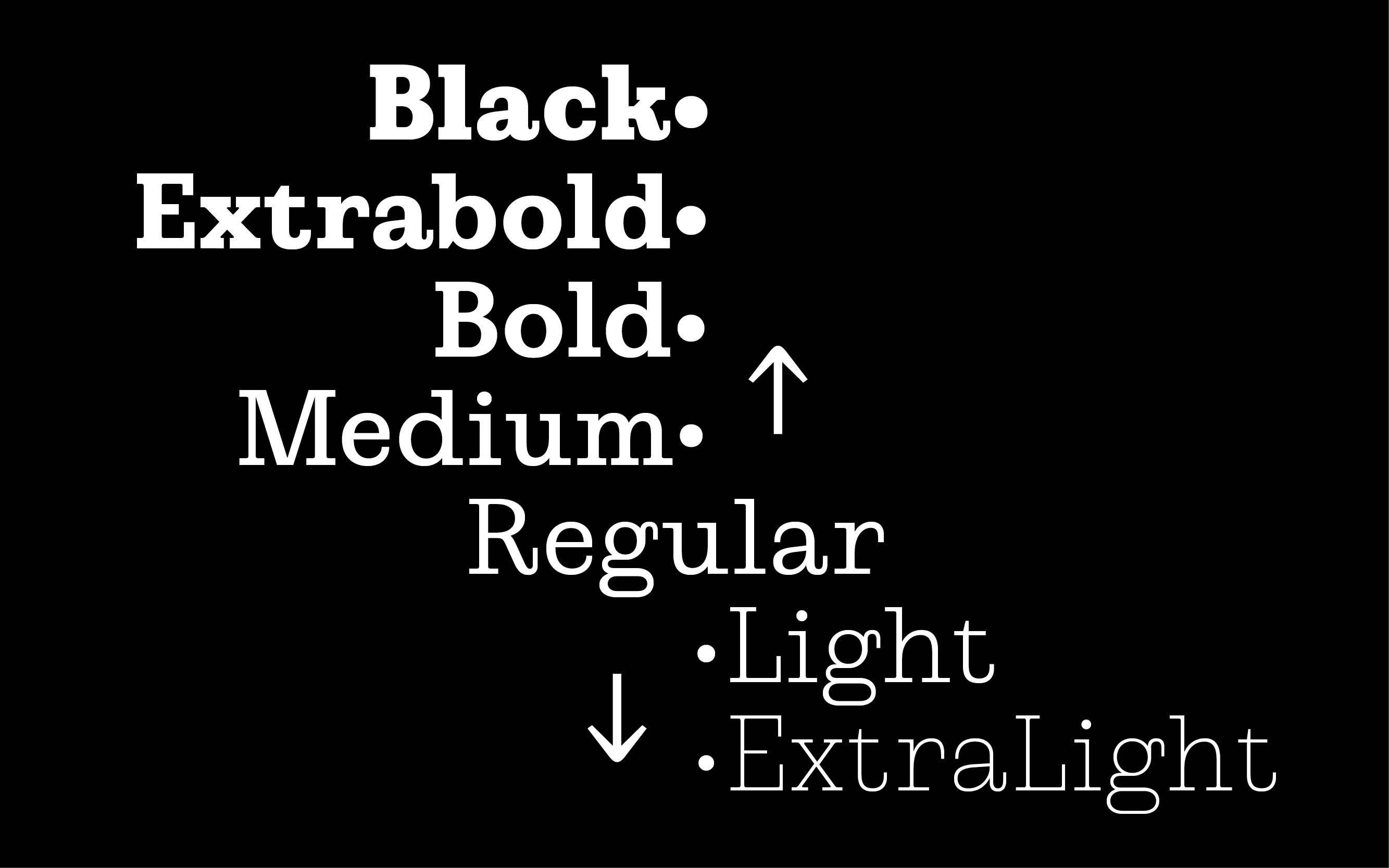
Styles
PoW Covenant is available in 7 weights, symetrically ordered in three ranges of weights from the Medium, both in ExtraLight or Black direction.
Alternates
The result of such a mechanical and geometrical process leads leads to some rigidity. Therefore, a little addition of curves has been added to re-root a bit the typeface from its original sources. In this idea, some alternates letters have been implemented.
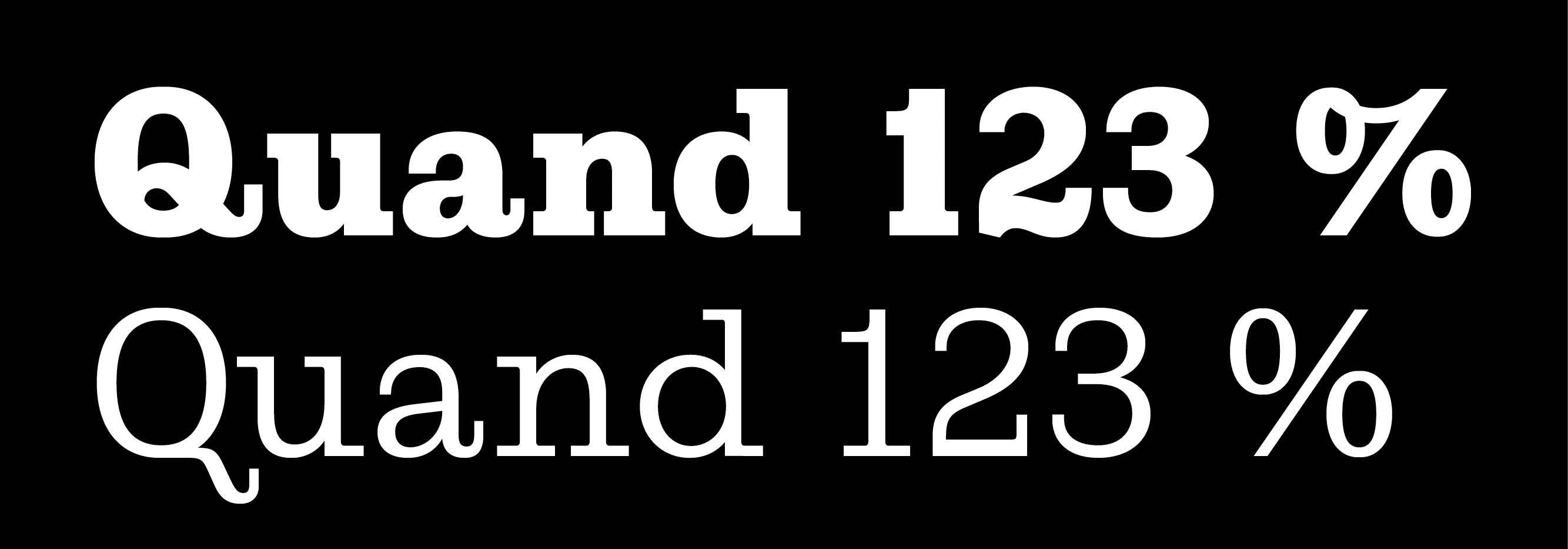
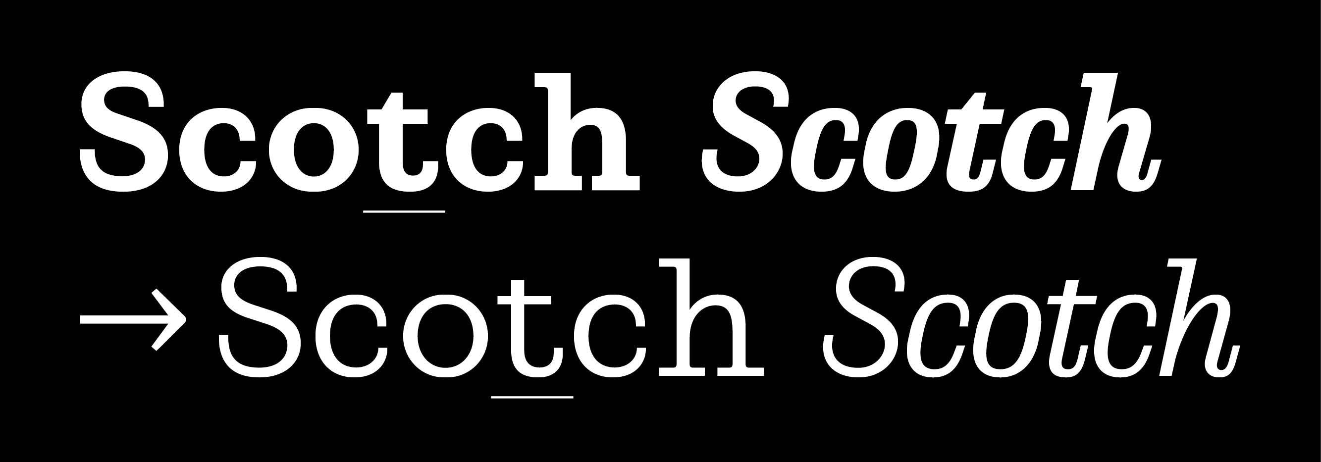
The alternate /t has been added. This /t has originated in the American sources, which have been mainly used in italics. The flat-topped t of the revived ‘Scotch Roman’[was] the model for all the new American ‘Scotch Roman’ types that appear around 1900 was the revived version cast in Edinburgh by Miller & Richard, since this form of t is not seen in the early Miller types, and very rarely appears in British modern face types33 Sébastien Morlighem, The ‘modern face’ in France and Great Britain, 1781-1825: typography as an ideal of progress, University of Reading, 2014, p. 331.
Naming
PoW Covenant’s name is a reference to an old French word for ‘convention’, that has been used to name the ‘Scottish Covenant’, a petition to create a home rule Scottish Parliament. A word at the meeting point of Scottish and French for a ‘Auld Alliance’ hommage to Scotch Romans.
Thanks
PoW Covenant is my first type design release, and I am really happy to publish it through the Proof of Words adventure. I would like to warmly thanks all the people who helped me and made this project happen. Fanny Hamelin for her most valuable feedbacks; Emmanuel Besse & Mathieu Réguer for their great advices on the first steps in Esad Amiens.
Sources
- De Vinne, Plain printing types, 1900
- Olocco & Patanè, Designing Type Revivals, Lazy Dog Press, 2022, p. 18-22
- Sébastien Morlighem, The ‘modern face’ in France and Great Britain, 1781-1825: typography as an ideal of progress, University of Reading, 2014, p. 331
- Cardone, réflexions sur la création d’un caractère pour l’édition, Fátima Lázaro
All scans are property of their respective authors:
•Scan of New Pica Roman n°2, Miller & Richard 1812 by J. M. Mosley, typefoundry.blogspot.com (last accessed 16 October, 2023)
•Scan of Fry 5 line Pica n°3, Edmund Fry 1816 by St Bride Printing Library, archive.org (last accessed 16 October, 2023)
•Scan of Scotch Roman n°36, Barco type founder, by James Puckett, Flickr (last accessed 16 October, 2023)